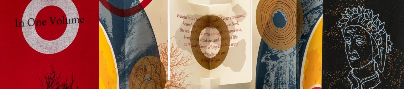
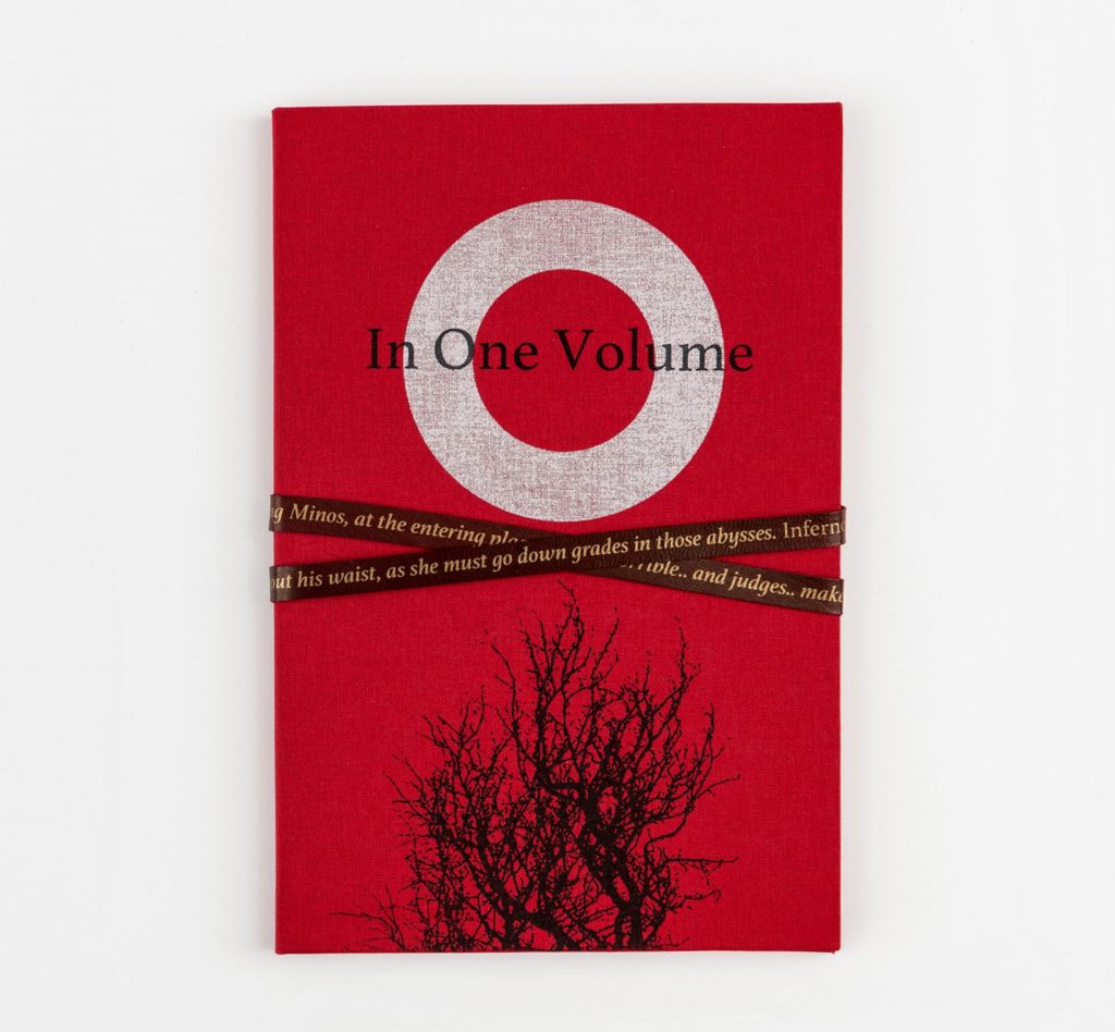
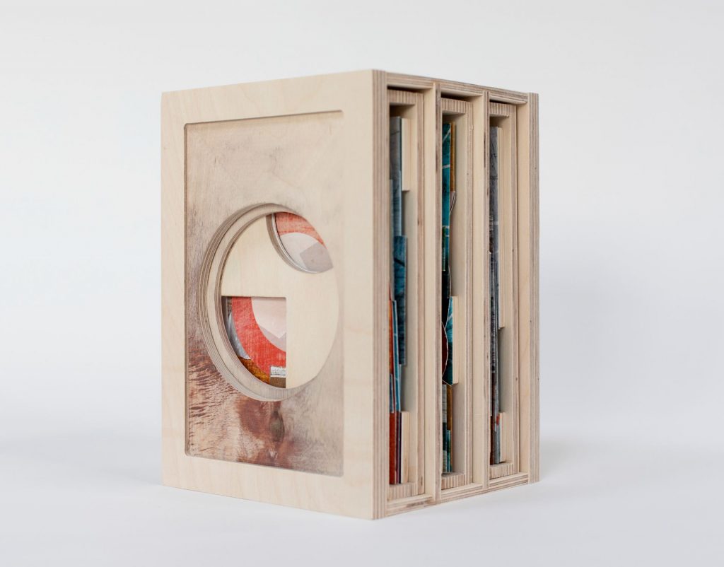
In One Volume, Kate Bernstein
Bound in book cloth with leather tie. Screenprinted on Somerset
paper. Book 23.5 x 16 cm, concertina extended 54 x 21cm.
In an edition of 12 copies.
In One Volume is a multi-layered response to Dante’s Commedia, and the translators and artists who have been inspired by it. In an echo of the rich experience of reading Dante, references within the work are both explicit and hidden, drawing directly on the original text and referencing the work of other artists and translators.
The book has a three-part structure; a cloth bound case binding with a tie closure contains a paper folio, within which is a concertina with a projecting central form that implies an open book.
This three-part structure echoes Dante’s extensive use of the number three in the form and organisation of Commedia and also allows for reflection on the relationship between Dante as poet and as pilgrim. The folio which through text and image, references Dante the poet’s exile, contains the concertina which reflects Dante as pilgrim; both characterisations are encapsulated by the third part, the binding, which represents the book form. The binding is closed with a tie printed with Cayley’s translation of Inferno, Canto V, in which Minos wraps his tail around a sinner a number of times, the number signifying to which circle of Hell the sinner should be sent.
The work was conceived as both an individual response to reading the Commedia and as a reflection on the vast canon of responses accrued since its inception. It utilises text in order to consider the relationship between the vernacular and includes comparative translations, and drawings after Botticelli and Domenico di Michelino.
Textual comparisons centre on the final Canto of Paradiso with the title of the work, a quotation from Longfellows’ translation:
I saw that in its depth far down is lying
Bound up with love together in one volume,
What through the universe in leaves is scattered;
The inner text is Kirkpatrick’s translation of the same; it is printed in the vernacular on the folio, behind Longfellow’s translation of Paradiso Canto 17, which refers to Dante’s exile.
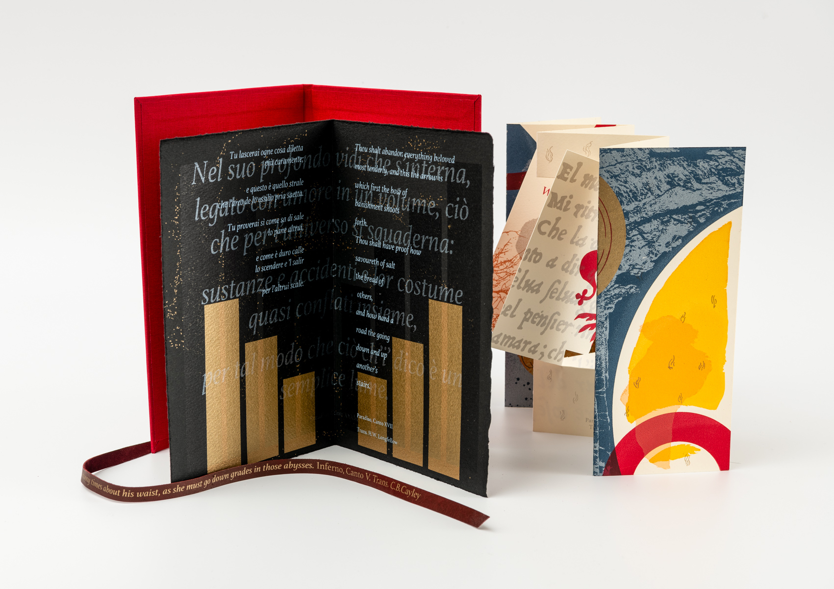
The final Canto of Paradiso was chosen as central to In One Volume as it reflects, to a degree, both Dante’s summation of the Commedia in book form and something of the experience of reading a work in which one is conscious of so many layers, references and allusions, perceived if not always understood, that it might feel fragmented and yet they are brought together in Dante’s extraordinary work creating the comprehensive sensation that as a reader you have been journeying alongside Dante the pilgrim.
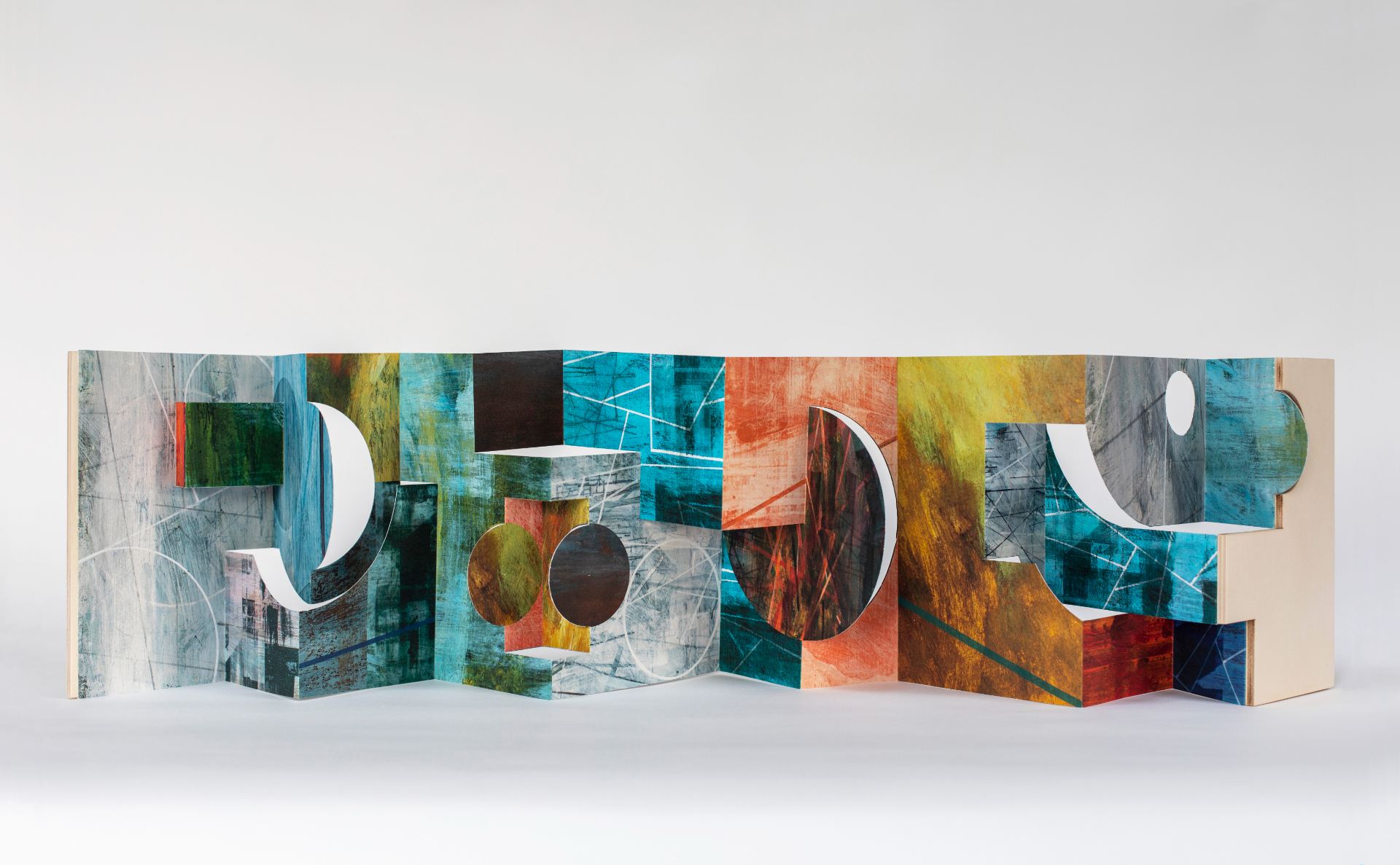
With an interplay of abstraction, image and colour, realised in screenprint In One Volume utilises artwork created through drawing, digital and paper stencils. It incorporates photographic imagery of water, rocks and trees echoing the physicality in the description of the landscape of the Commedia.
Circles and parts of circles are the main motif of the front of the inner book with one complete circle filled with figures and another with hand drawn concentric outlines that echo manuscript illustrations. The reverse of the inner concertina is printed throughout in red and silver in reference to the heraldic colours of the Florentine Guelphs. Dante and Beatrice, after Botticelli, are seen beside the Florentine Fleur de Lys which is framed by the back of the inner book, a reference to the political context in which Dante was writing. The text is an enlarged reproduction of the opening Canto of Inferno from the Aldine Press, 1502.
The folio, printed on black Somerset paper, emphasises Dante the man, the poet, with layers of printing that build in complexity and which refer in translation and in the vernacular to his exile with the vernacular realised, alongside a laurel wreath, in black varnish.
The loose case binding continues the red and silver colouring with text on the reverse and text printed on the leather tie which is the sole method of closure, text being the essential element that brings together the whole.
The Divine Comedy, Ian Bottle
A box set of 3 volumes has been produced in response to Dante’s Divine Comedy: Volume 1: Inferno, Volume 2: Purgatorio and Volume 3: Paradiso. Each volume is in a concertina format of 9 pages extending to 112 cm, printed on double-sided archival Bockingford paper in pigment inkjet ink, each with a wooden cover and individual slipcase.
Each book is 20 cm high x 14 cm wide in a case measuring 22 x 15 x 3.5 cm deep. The first edition is comprised of 9 box sets (3 volumes in each) contained in a larger case measuring approximately 24 cm high x 14 cm wide and 16 cm deep.
My work is concerned with time and memory and how it might be embodied in material and spatial conditions. My methods have been influenced as much by the impact of technological advances in the storage and retrieval of information as they have by a compulsion to find clarity in circumstances that seem inherently contradictory. The simultaneous building up and breaking down of an image or object until a coherent structures emerges is driven by a desire to make sense of the ambiguous correlation between patterns within our perception, thought and action. This was what in large part drew me to The Divine Comedy. Initially I had planned to focus my attention on Inferno alone, inspired by the many powerful visualisations of the structure described in the poem, the Renaissance illustrations by Botticelli as much as the more interpretive responses by Robert Rauschenberg.
As I started to read The Divine Comedy, looking at different translations and listening to a number of cantos read in Italian, I found myself making analogies with aspects of what has unfolded throughout the pandemic and how this has led me to re-examine my values and fundamental aspects of my practice. As I began to explore the structure of the work as a whole, I became increasingly interested in the complexities of the relationship between abstract concepts and the physiological references made, and in particular how the ideas are developed and echoed.
My starting point for the work was to develop a strategy that would allow me to continue reading and researching as the work progressed. The ‘architecture’ of the book made in response to Inferno was inspired by the opening lines of the first canto, working from the centre of the book outwards towards either end. The more I read of the poem and listened to lectures and podcasts, the more determined I was to work on the structure and the imagery for Purgatorio and Paradiso simultaneously. Alternating between making models and maquettes, I worked on the content: establishing links, making parallels between the relative verses from each and at the same time making paintings and drawings and working with a range of other material (sculptural and digital) that resonated with my interpretation made as intuitive and interpretive responses.
Whilst each constructed book has certain constitutional elements in common I have altered the geometry and the orchestration of colour and narrative reference with the intention of embodying an idea uniquely different and relative to my response to each canticle.
Inferno – Narak – Hell, Prerna Chandiramani
Three fold-out sections, sewn into concertina spine. Relief printmaking techniques: text is a combination of stamping and hand-cut stencils, plus lino printing, some watercolour painting and stitch is used in the pages and the cover.
Printed on Zerkall pages and cover Southbank paper. Dimensions when closed: 11 x 16 x 1cm. In an edition of 9 copies
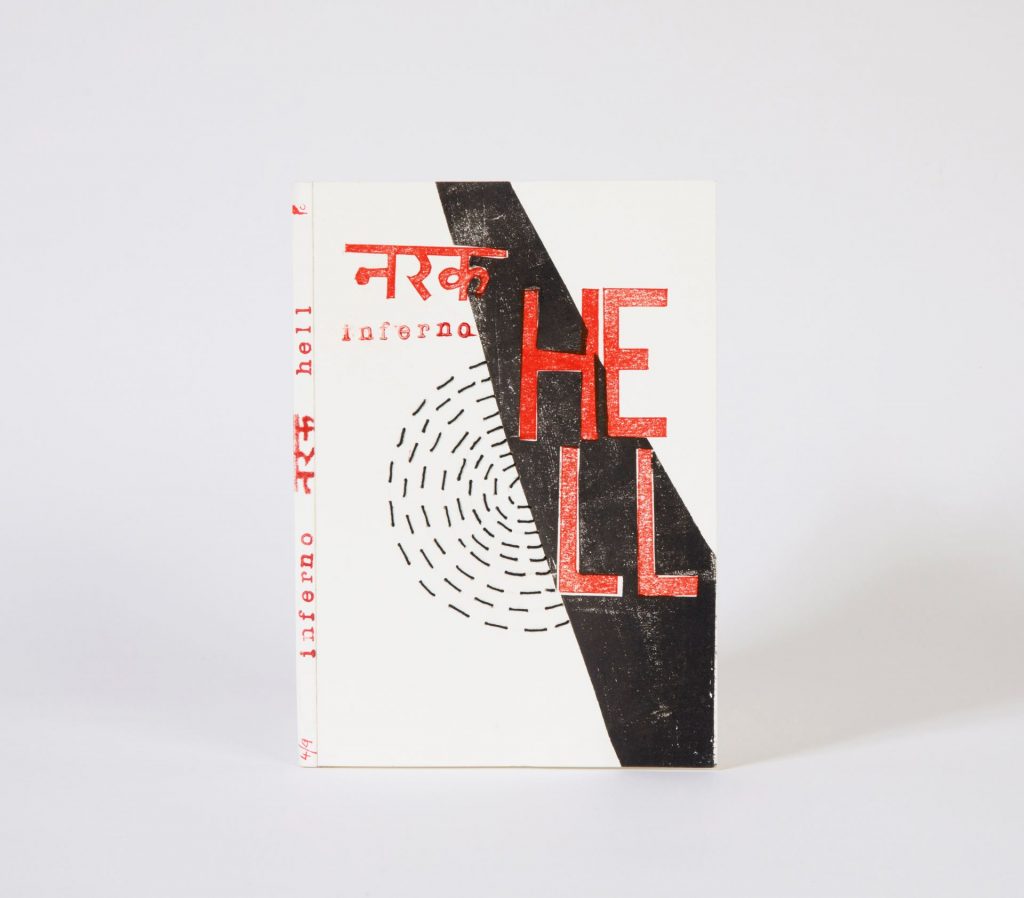
My book titled Inferno – Narak – Hell is produced as a limited edition of nine handprinted and hand bound copies. On reading the original book and numerous research papers I found that Dante had chosen to write his poem in the Italian language and not in Latin. Using language as the primary theme I have translated the nine sins in Hindi, an Indian language. The book comprises of word translations from Italian to English and Hindi.
Dante also followed an orderly structure with the symbolic use of 3 and 9. This is reflected in the binding of the book where three signatures are used. Each signature unfolds to reveal the three languages.
The nine sins by mankind have been metaphorically symbolised by the three beasts that appear in the first canto in Dante’s journey through the forest: the leopard, the lion and the wolf. They also represent the three major divisions of hell, which unfold from the three pages of the book.
While Dante’s Inferno describes a dark and gruesome journey of pain and suffering through hell, I have taken a more spiritual approach. I believe it is a reflection of struggle and temptations faced by humanity to do what is morally right; it is an emotional journey that is necessary to reach heaven.
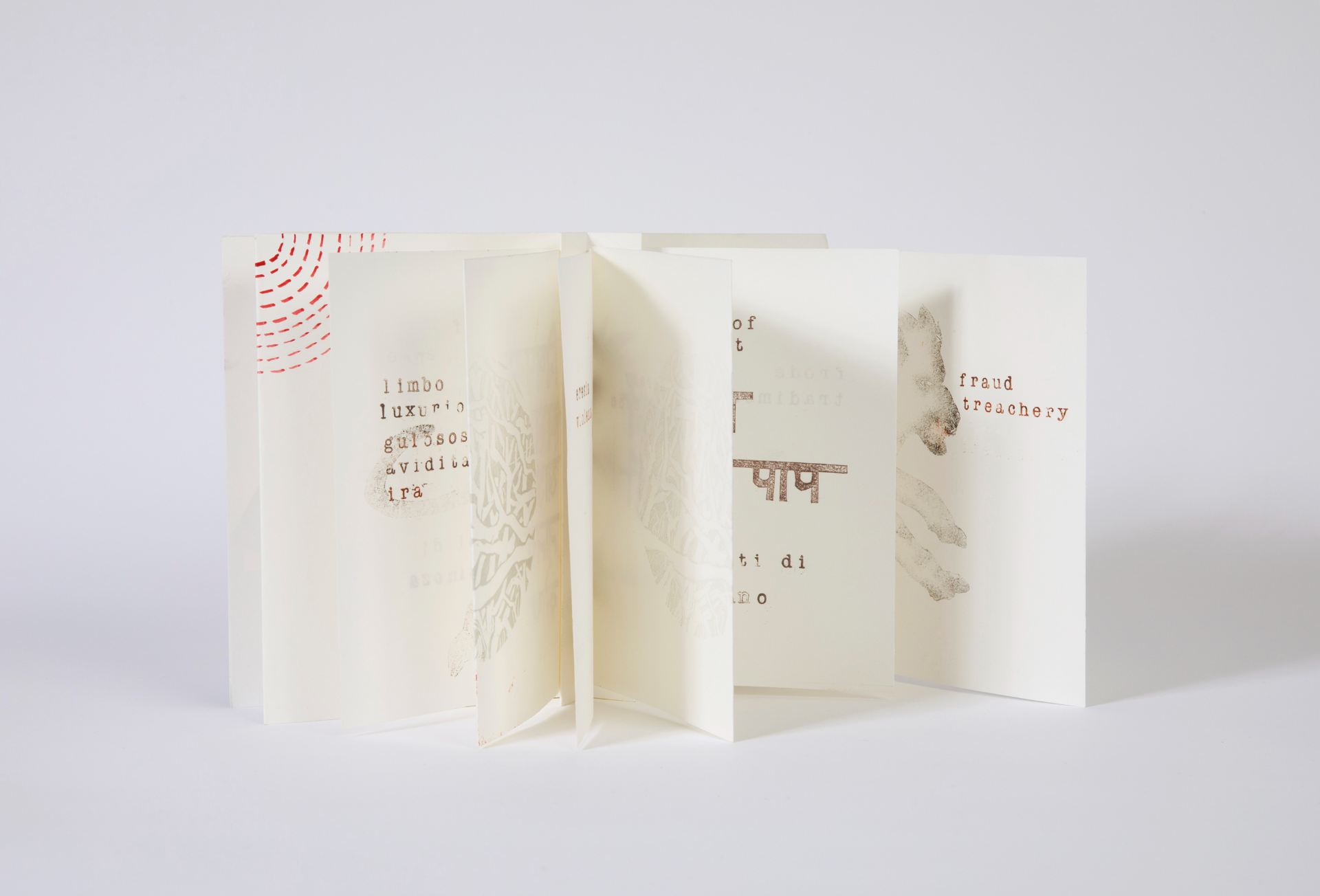
The book is constructed using an accordion fold with signatures attached in every valley fold using a pamphlet stitch. The accordion fold with the bi-fold pages lends itself to the subject matter of a journey unfolding. The nine circles of hell are highlighted in stitch on the cover and painted on the inside covers. The use of a subtle monochromatic colour scheme with some splash of red represents the struggles and temptations faced by mankind.
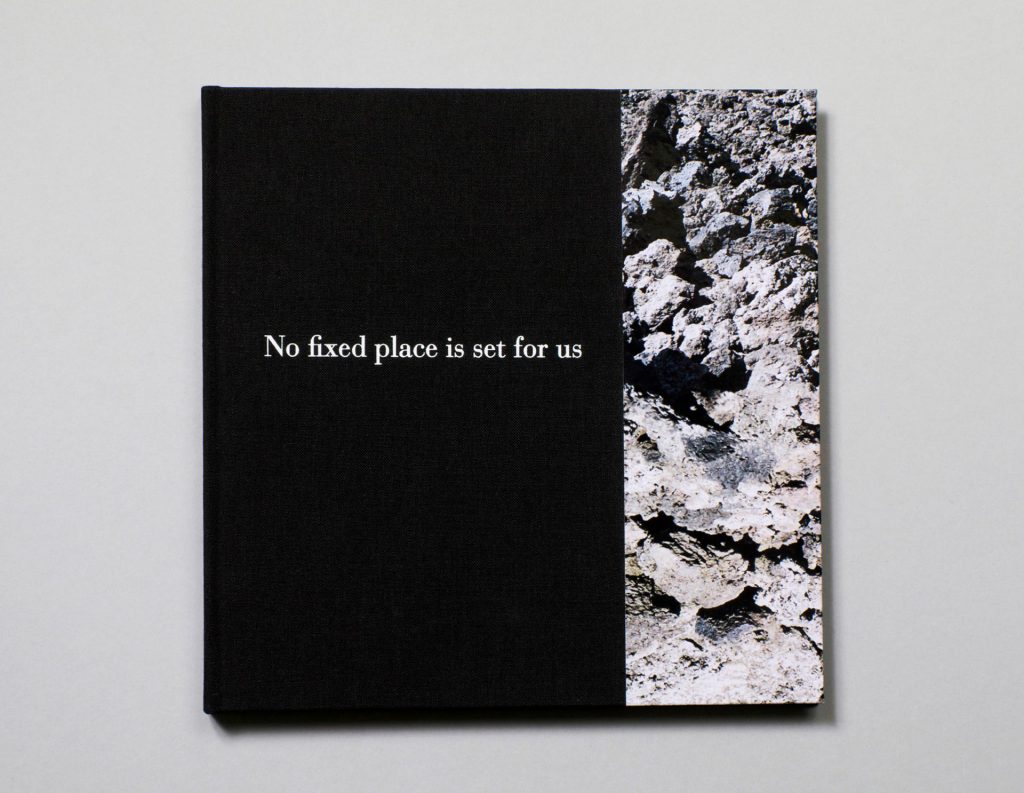
No fixed place is set for us, Judy Goldhill
Casebound in black Windsor bookcloth and printed paper. Foil blocked front cover and spine.
44 pages plus fold-out page. Indigo printed on to 140 gsm Arcoprint EW, Curious Touch endpapers. In an edition of 25 copies.
My inspiration for No fixed place is set for us came from a fleeting sentence in the book Dante’s Divine Comedy, A Journey Without End by Ian Thomson. The writer and critic John Mullan, whom I met while on daily walks among the dark, muddy woods of north London’s Hampstead Heath as the world emerged from lockdown, and I was searching for the theme of my book, recommended this work to me. The Heath was the setting for many conversations about Dante during the bleak early months of 2021.
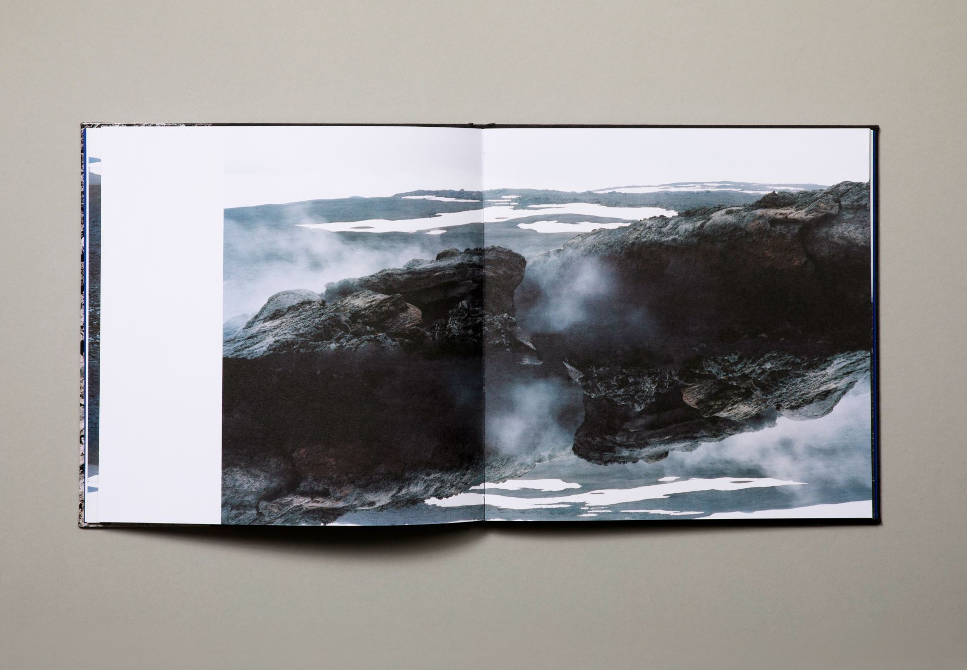
The work’s initial development was a complex process, at times echoing the contorted, spiralling stages of Dante’s own Purgatory. I eventually refigured a series of photographs I had taken of Mount Etna. In medieval Italy, it was believed that the mountain of Purgatory was in Sicily, on the summit of Mount Etna.
Repetition has been a regular feature of my artist’s books. I chose to experiment with this procedure, to invert and sometimes flip the images I had of Mount Etna, thus replicating Dante’s use of repetition and mirroring within The Inferno and Purgatory. The layout of each page is designed to be different from the next, with the space of the left-hand margin varying, an ambiguous space that could have included a quote from Dante or other material, an open space that gives a fluctuating rhythm to the book’s reading.
Dante speaks of the sapphire blue waters surrounding Purgatory, which I have reimagined using the tactile Curious Touch end papers of the volume. The book begins with images evoking the horrors of the Inferno and gradually moves through the smouldering volcanic landscape, ending with the crescendo of the blinding light described throughout Purgatory, signalling Dante’s entry into Paradise.
Of No fixed place is set for us, David Alan Mellor writes:
These pictures monumentalise the ashy anguish of Purgatory suggesting that, perhaps, there is no way out – a denial of the promise and trial of the purgatorial narrative. For these landscapes – stretched over the aching bones of cooled horrors – have a perpetual torsion. Here are laid out dead muscles – age old and blackened. They have a covering of crusted scabs of past desires which fell foul of a larger law. Occasionally they flare with cloudy spouts whose chill rises like – liquid oxygen – to paralyse any entity which might touch them. Declivities are the homes to anamorphic slivers of pure ice cream circumscribed by the darkest chocolate – but these are not really edible, not under any circumstances, other than being drawn to break your teeth. Because the dry cinders will scrape and tear your mouth before you luxuriate in the delicious fields of cold cream. The bi-lateral symmetry of these brown passages, with a reversed out, improbably scorched negative dove-white area suggest the gulfs and stretchings of the eerie topology of the Shroud of Turin. Then the dark grey, intractable volcanic rock – tuff – is revealed as something altogether visceral. Bloodied sinews are distended.
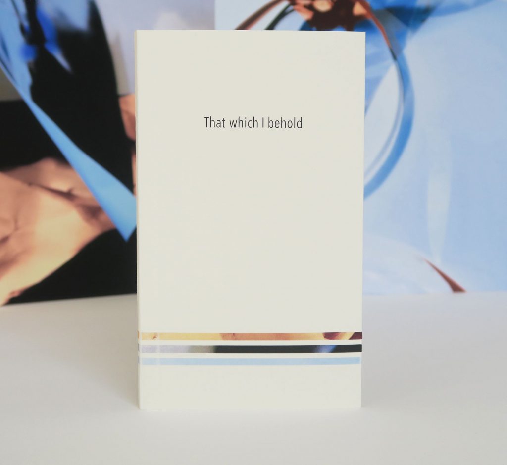
That which I behold, Sophie Loss
Sewn multi-section binding under soft cover 17 x 10 cm, and three single sided injet printed cards, 27.3 x 34.4 cm.
Laser print on Canaletto 125gsm Velino pages, and Colorplan 270gsm Natural White cover. In an edition of 18 copies.
The frontispiece of my book is a reproduction of an illustration of Purgatorio, canto X by Federico Zuccaro; this depicts Dante and Virgil on the first terrace of Purgatory, they are in conversation in front of one panel of a series of wall carvings.
That which I behold consists of two elements, a small format book and three larger single sided prints. The prints may be laid flat, or preferably stood facing the viewer/reader, who holding the book, can look from one to the other.
The three sheets correspond to Inferno, Purgatorio and Paradiso, though the images that they carry are abstract and impressionistic. In these there is overall effect, and there is complexity in the accumulated detail, one may think of Bosch or Brueghel. These scenes with its ongoing activities encompass all the many spirits that are encountered in the Commedia, yet they might not be discerned. They represent the three zones that Dante travelled through and operate as allusive mise-en-scènes, a form of backdrop or scenery to the journey that Dante, and you, and I take.
The voyage is presented in the small narrow book nestles comfortably in the palm of the hand – there is intimacy here. On each of 27 right hand pages is a photograph of one, two or three people, pictures I have taken on the streets. These were people walking, pausing, and talking, going about daily life – though now the backgrounds have been erased and replaced by a uniform white field, the context of each moment has been removed. Just as in painted and graphic representations of the Commedia, in which several depictions of the poet are seen in the same image showing his progress, each individual or group may be Dante and his guides, each an avatar, each a different manifestation.
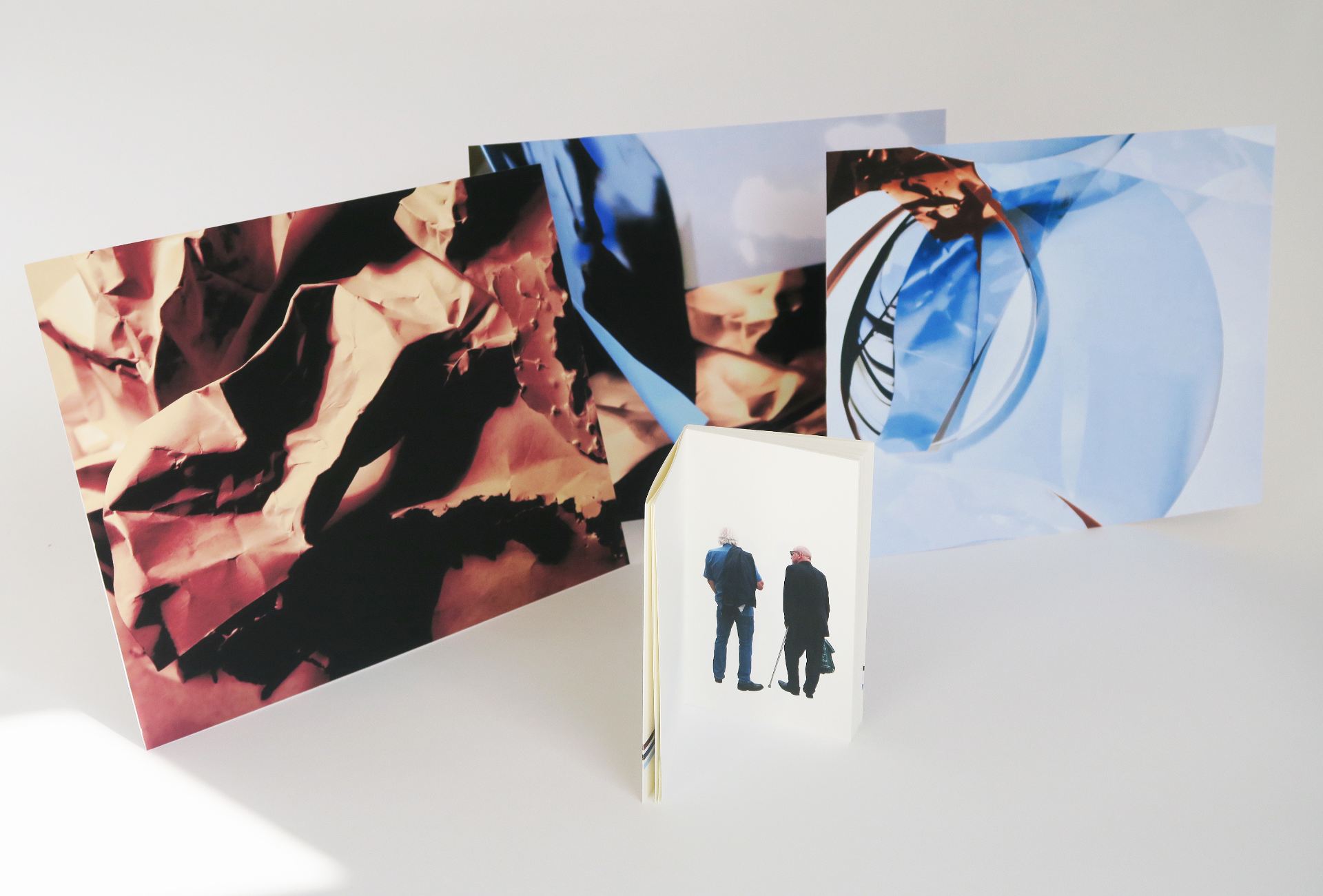
My intent is that the work may be realised in the reader’s experience of the movement from book to backdrops and back, as with every turn of the page different figures appear, and at every glance from a particular page to the three scenes, new interconnections made. It an experience that mirrors that of Dante, as his awareness shifts from his own knowledge and consciousness to the fantastic and incorporeal worlds in which he finds himself.
And if nature or art ever laid baits
To catch the eyes, and so possess the mind,
Whether with human flesh or pictures of it,
Paradiso canto XXVII, translation by C. H. Sisson
Riverine Memory, John McDowall
Sewn stab binding under folded overlapped spine, 31.5 x 42.7 cm. 20 pages. Laser printed on 115 gsm Somerset Book White and 135 gsm Colorplan Cool Grey. In an open edition.
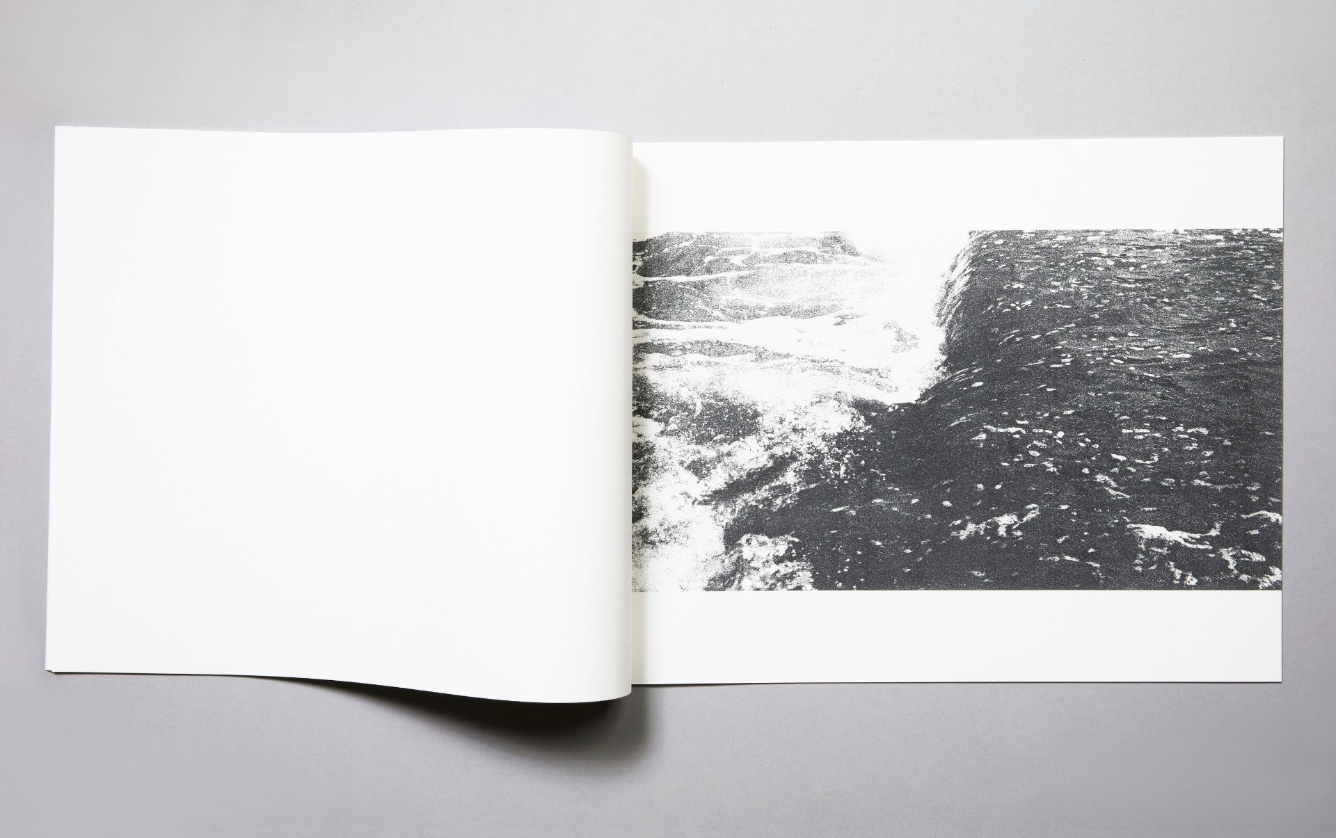
Under pale grey paper covers, the book consists of a sequence of printed recto pages, each carrying either an image or a written text. Three pages present a series of single fine meandering lines; these sheets are intercalated with two pages, each with an extract from The Divine Comedy – Purgatory, describing Dante submerged in the River Lethe, and drinking from the Eunoe. The sets of three tercets are laid out with the Italian on the right and Robin Kirkpatrick’s translation, in pale grey, to the left. Following the third graphic line is a short passage, the end of the Anna Livia Plurabelle chapter of James Joyce’s Finnegans Wake – this is positioned on the left of the page. After this is an image of flowing water, curling over a weir, the high contrast photo is printed emerging from the gutter of the book, and cut off at the fore-edge, with margins at the top and base of the page. The preceding lines, which thin to a point on the field of the page, also either pass from sight in the fold of the gutter or at the page’s edge. At any of the open spreads the slight showthrough of the book’s paper gives a glimpse of the previous page and a hint of the forthcoming one.
One of the initial inspirations for my book was Luca Signorelli’s fresco portrait of Dante. In this the poet is seen reading. He has two books open, his left hand marks the place in a book lying flat in front of him, and his right hand crosses over to hold open or turn the pages of a book standing, propped up against two other closed books, to his left. He is looking at this book. I find this a very eloquent depiction of the act of reading, for reading is always the relational operation of intertextuality – as one reads, one’s past reading and experiences are also present. Whether the association is with something from the reader’s inner library, or from another book there at that moment, or is the content of a turned page – all is carried over in the memory, from recto to verso, and from book to book.
This affinitive relationship is, inevitably, also a mutable one – it is a process of variance and interpretation, this change may come from selection and refinement, or from misremembering. There is an evolution in the flow of impressions from text to text, recollection to recollection, and from one moment to the next, as all that one has read and recalls tells on what one reads and will read, and know.
The snaking lines, which can be read as the course of rivers, are photographs of cracks in the ceiling of my studio. As a form of visual neologism they may be both at once, progressing in one, or another direction, either from a river’s source or toward a fissure’s possible elongation. The other image is my photograph of the River Aire, that of the moment when the water’s dark undulating surface brightens as it tips over the edge of the weir.
The movements and conjunctions in the book allude to discourse and translation, to Dante’s many conversations along his journey, and to the dialogue of two washerwomen across the Liffey, the metamorphoses of people, and the transformations of language, and of memories, erased and restored.
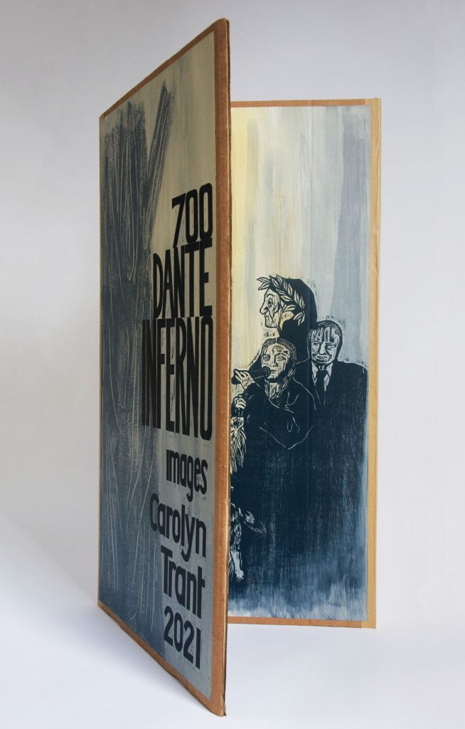
Inferno Cartonera Altarpiece, Carolyn Trant
Altarpiece triptych: 84cm x 41cm. Woodcut on paper, hand painting and collage on thick corrugated packaging cardboard. Single copy.
Smaller versions of the book come as a stack of four cartoneras, these contain the same printed matter and concertina books, with some hand painting and collage. In an edition of 6 copies.
Cartonera is a South American kind of street or community publishing, often political, using recycled packaging cardboard for binding for economy, and it is obviously ecological, and a medieval altarpiece was a way of telling stories visually to a large audience.
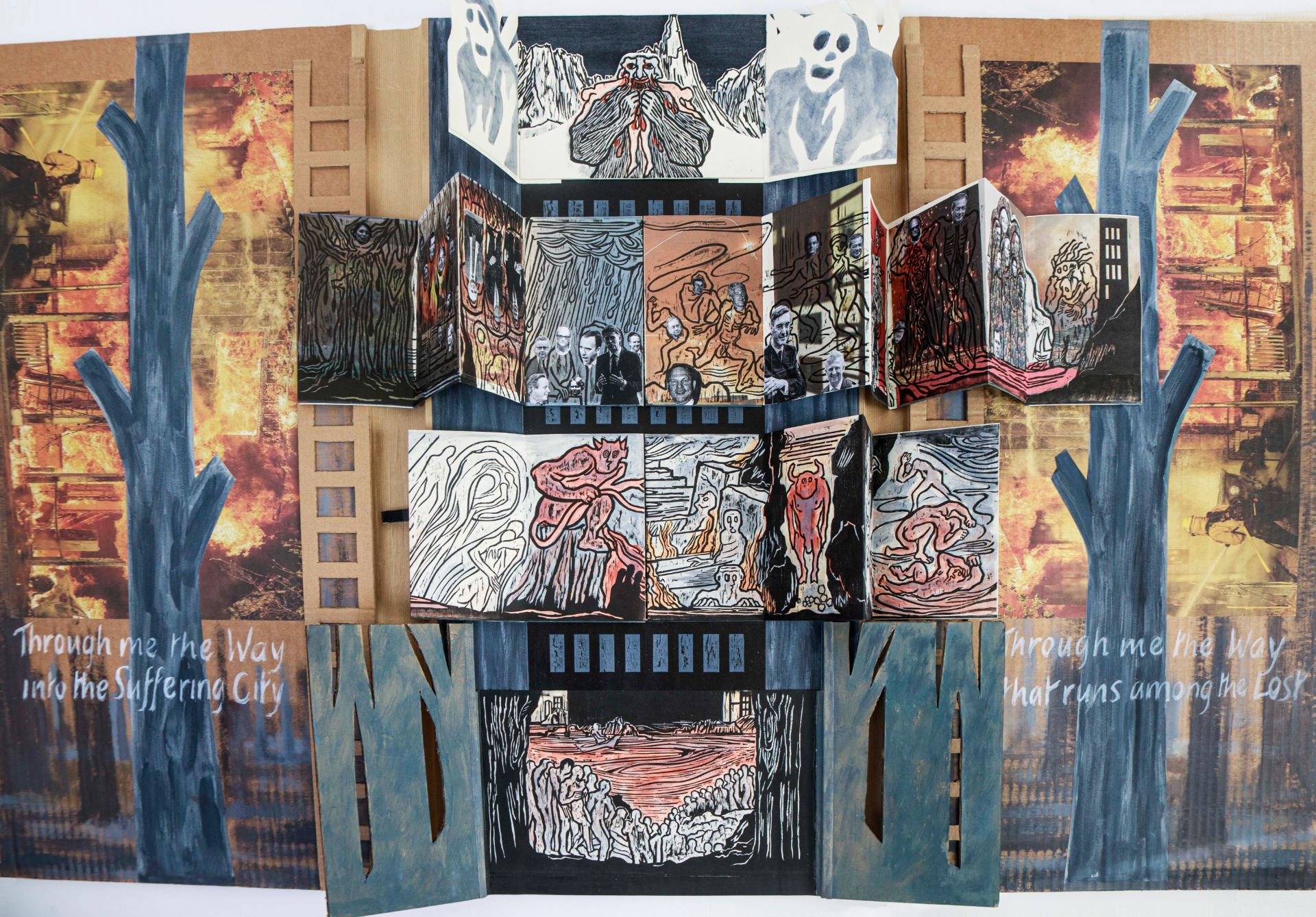
As the ‘book’ opens, on the right is a grisaille, tinged yellow by the fires of Hell, with donor figures. Dante is Everyman, but David Attenborough replaces Virgil, and Greta Thunberg Beatrice, she represents the female principle, youth, idealism and the future. Like Virgil’s Aeneas in search of prophetic vision, David Attenborough travelled widely and speaks for the crisis of our times. They pose alongside three beasts Dante met first in the wood, a lion, leopard and wolf, now on equal footing with the humans and leading them – previously they had unjustifiably represented pride, pleasure and avarice.
In the left panel is a tree set against the forest fires of the climate crisis, and, as you open the donor panel out to the right, there is another. In between is the column of the Tower, which is set in a larger tree with concertina books spreading out like branches depicting scenes and characters within Hell.
In the Christian tradition the tree is a symbol of salvation, so here Hell and Salvation stand back-to-back. The three trees refer to the Crucifixion where two of the crosses were for common criminals, one who repented and one who did not… within Inferno there is a complex itinerary relating to Christ’s Harrowing of Hell.
The opening to Hell is revealed behind the trees at the bottom of the Tower, a mass of grey figures gathering at the Styx waiting for Charon to ferry them to the city of Dis. The Tower representing Dis could suggest many things, Capitalism, Blake’s satanic mills, or the Grenfell Tower – a prime example of Avarice and Fraud, much castigated by Dante. The Gates of Hell include the words ‘Through me the way into the Suffering City, Through me the way that runs among the Lost…’ – words that suggest a very contemporary documentary about inner city poverty and rough sleepers perhaps. ‘Abandon hope all you who enter here’ seems too fatalistic for our age – we should be working for paradise here and now.
The four concertina books on the Tower open out with brief descriptions handwritten on the back. With the colours of blood, ash and fire, the hand-painted woodcuts of the lower book introduce Dante’s more archetypal figures – including Pluto, Minos and Cerberus.
Dante is political, critiquing contemporary villains of his day as well as of the past. So the upper concertina book highlights his targets, which mirror contemporary corruption – propaganda and fraud, swindlers, tax evaders, usurers, war criminals and crimes against women. We have plenty of our own arguing demons. Woodcuts here are printed over newspaper images with pasted on heads of current controversial figures. Who would Dante, and we ourselves, like to put in Hell in 2021?
This upper book centres on the old Man of Crete and the idea of the classical ages, the loss of Arcadia, and the idea of the Wasteland picked up most famously by T S Eliot. It ends with the horrific story of Ugolino and the Tower of Famine.
At the top of the tower are tree roots, representing the ‘flip’ as the travellers are projected out onto the next steps of their journey, with doors revealing the Land of the Giants, icy, empty of life; and the three headed Devil eating his victims, a horror evoked in medieval times, not taken very seriously today – here he is a small almost comical character.
The dark sky suggests the next stage of the journey to Purgatory and Paradise, but how will our own story end?
Esta selva selvaggia, Martín Vitaliti
Perfect bound. 176 pages + cover. Photocopy on recycled 90gms paper and laser print cover on 200 gms color paper.
In an edition of 25 numbered copies.
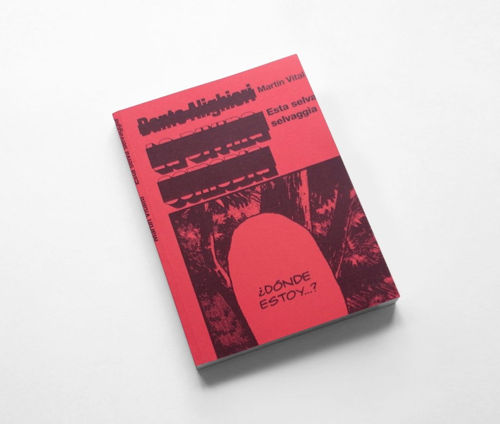
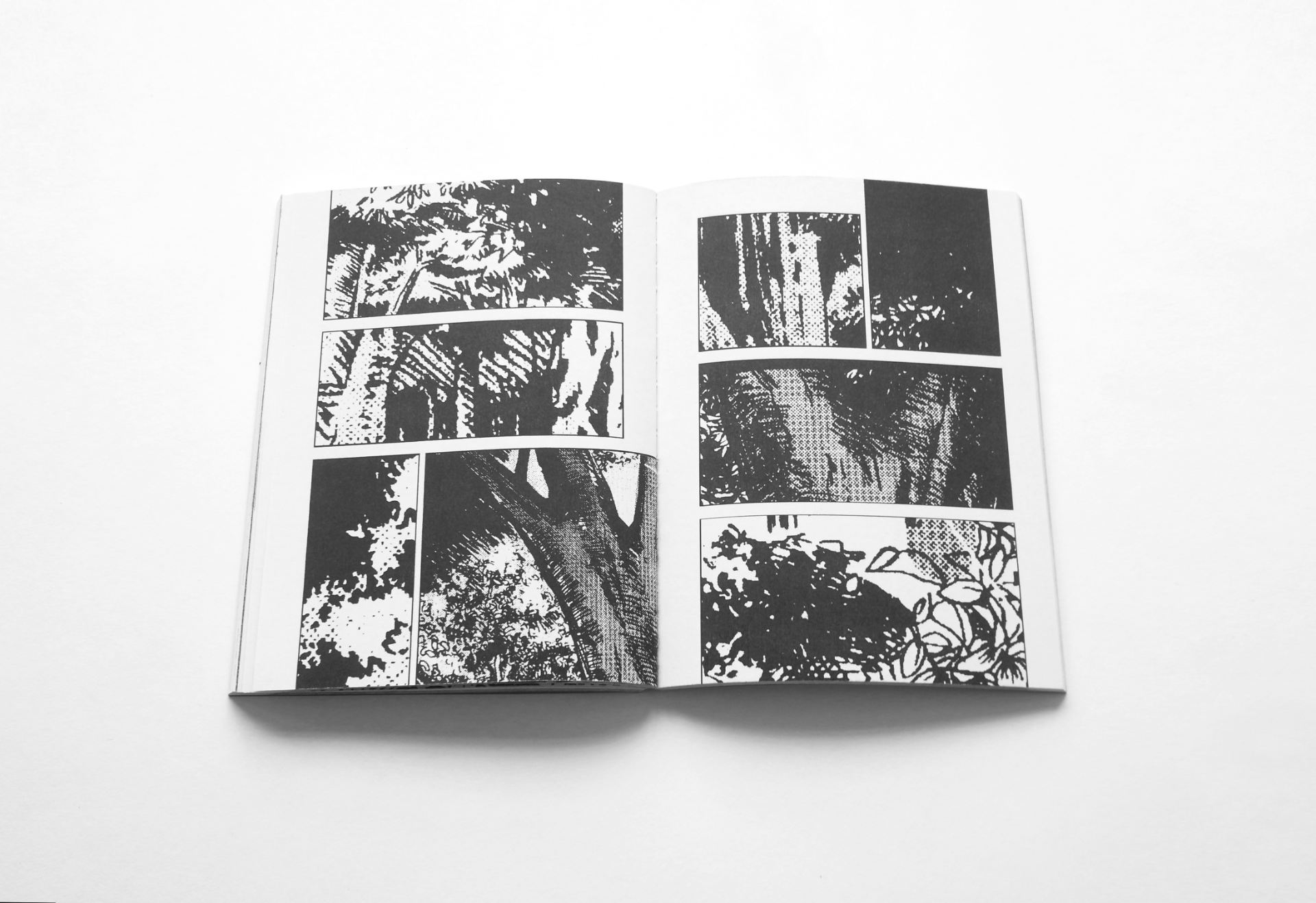
Esta selva selvaggia (This wild wood ) is based on the manga version of Dante’s Divine Comedy published in Spain by la otra h.
Details of this forest landscape as depicted in the background of the opening frames of the manga have been extracted from these first pages. They have then been distributed to the rest of the book, occupying all three sections (Hell, Purgatory and Paradise), following the layout of the original pages.
In this way Esta selva selvaggia proposes transforming the symbolism of the forest as the ‘wrong path’ in the original story, turning it into the protagonist, and a place to be contemplated in which silence and stillness predominate, so as to give other meanings to it.